Project Background
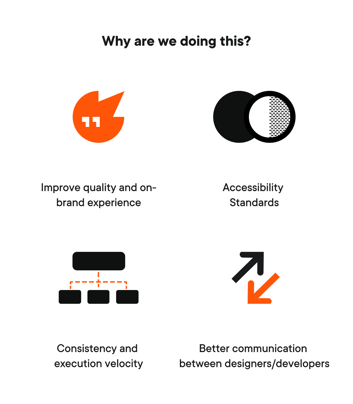
Why we revamped our design system
At PlayVS, we’re committed to creating exceptional user experiences for players and coaches. To support that, we embarked on a comprehensive revamp of our design system to streamline our design process, enhance consistency, and elevate the overall user experience.
Our previous system, while functional, revealed several issues:
1. Inconsistency in UX patterns, colors, and opinions on what’s “right”
2. Lack of accessibility considerations
3. Lack of clarity around detailed documentation and usage
4. Repetition of common UI components across teams
5. Lack of a distinct, ownable visual identity
My role
- Owner of the design system: planned, built, and maintained the entire UI component library
- Designed every core component myself, from foundations (tokens, styles) to complex patterns
- Created a custom icon set and spot illustrations to strengthen the PlayVS visual identity
- Documented components and usage guidelines for developers and designers
- Acted as the poc between design and engineering, aligning Figma and Storybook
- Led training sessions to teach developers how to navigate Figma and adopt the system in code
Project Background
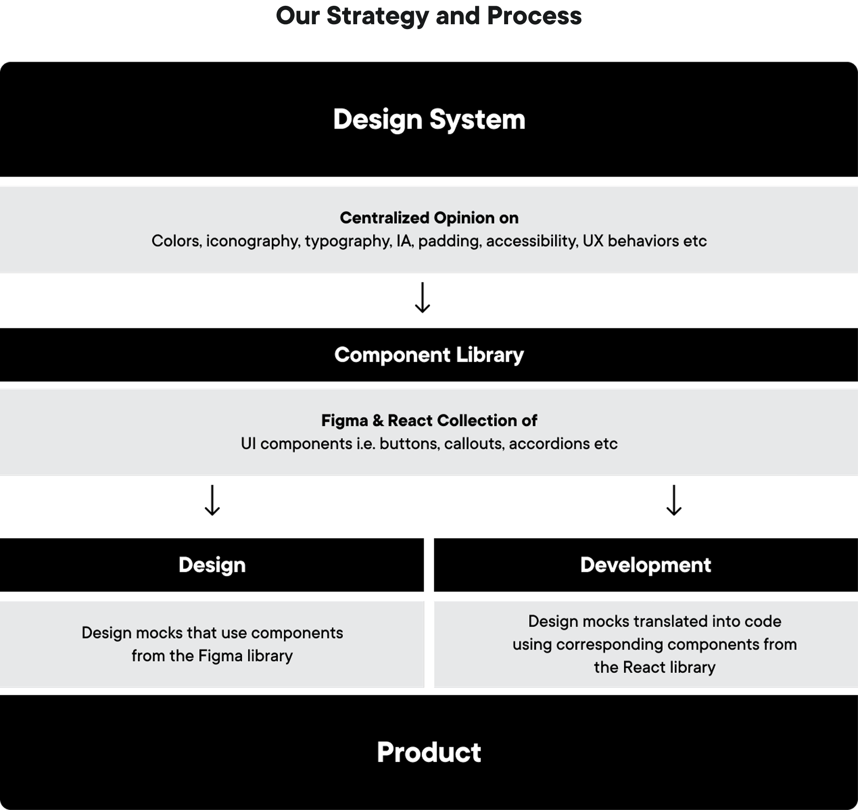
Our approach – How we solved it
Step 1: Research & audit: Reviewed existing UI and the old system to map strengths, gaps, and duplication.
Step 2: Define guiding principles: Empowering, Engaging, Inclusive, Fun, Accommodating as the north star for all decisions.
Step 3: Collaborate & iterate: Partnered with designers, engineers, and PMs to rebuild tokens, foundations, and components, testing and refining as we went.
By following this approach, we've significantly improved the consistency, efficiency, and quality of our design process. Our revamped design system has led to a 35% increase in development time, enabling our team to create several new user-friendly products that align with our brand identity.
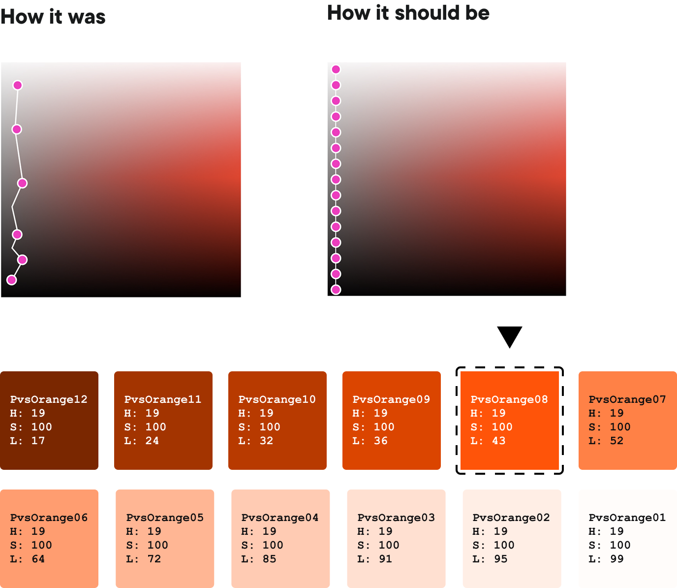
Foundations
Updating our design tokens
Our UI is anchored by the iconic pairing of Brand Orange and Greyscale. To ensure a consistent visual experience, we adopt the HSL (Hue, Saturation, Lightness) color model in our design process. Within our color library, the hue and saturation remain constant while variations in lightness create a dynamic range of tones.
Foundations
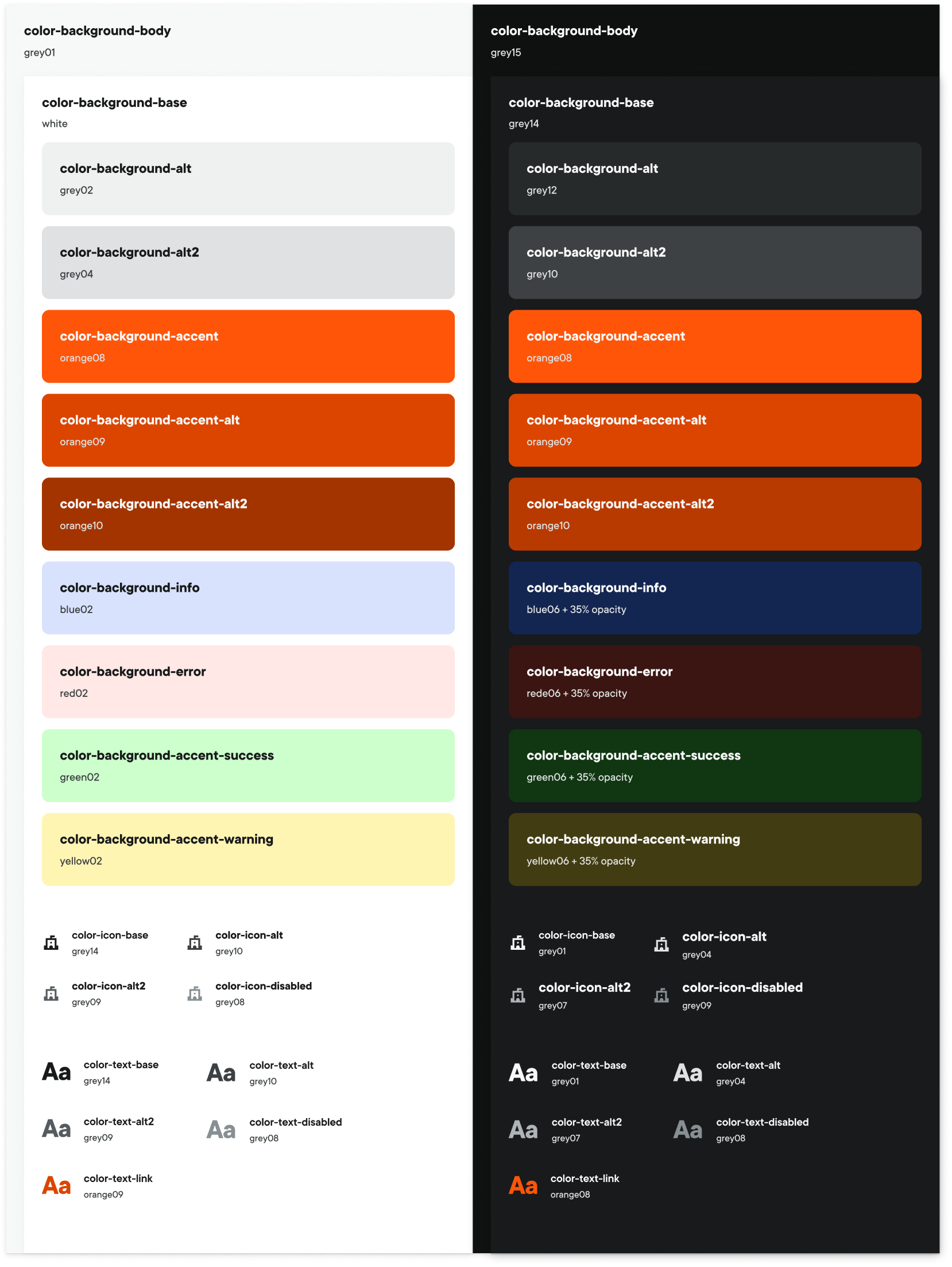
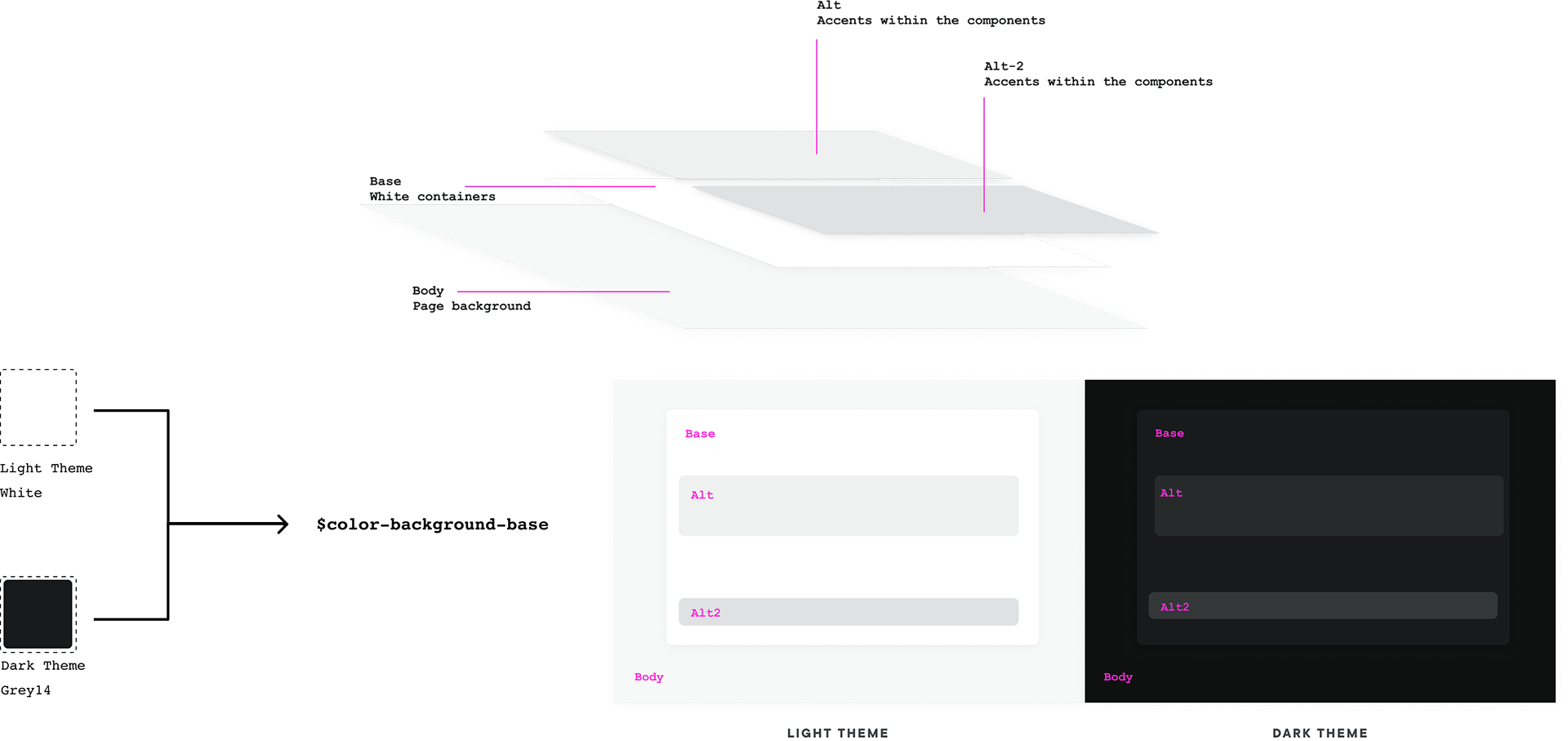
Theme hierarchy
Color usage should convey a sense of visual and navigational hierarchy. Using color to segment your layout and UX into sections or draw user’s eye to a specific task. This theming approach is utilizing tokens that are designed to maintain color hierarchy. Following this logic we can ensure consistency and accessibility in our designs.
Additional bonus is it makes it easy to spin off additional themes :)
Additional bonus is it makes it easy to spin off additional themes :)
Foundations
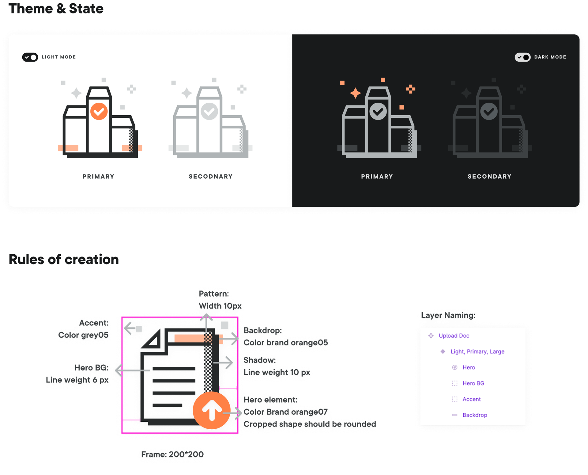
Light and dark theme
Foundations
Inclusive design
Color & Contrast
We treat contrast as a hard requirement. Text and key icons are mapped to tokens that meet WCAG AA (and aim for AAA where possible). For non-text elements like button containers, we follow a minimum 3:1 contrast ratio against their background, informed by WCAG and Material’s contrast research.
We treat contrast as a hard requirement. Text and key icons are mapped to tokens that meet WCAG AA (and aim for AAA where possible). For non-text elements like button containers, we follow a minimum 3:1 contrast ratio against their background, informed by WCAG and Material’s contrast research.
Foundations
Inclusive design
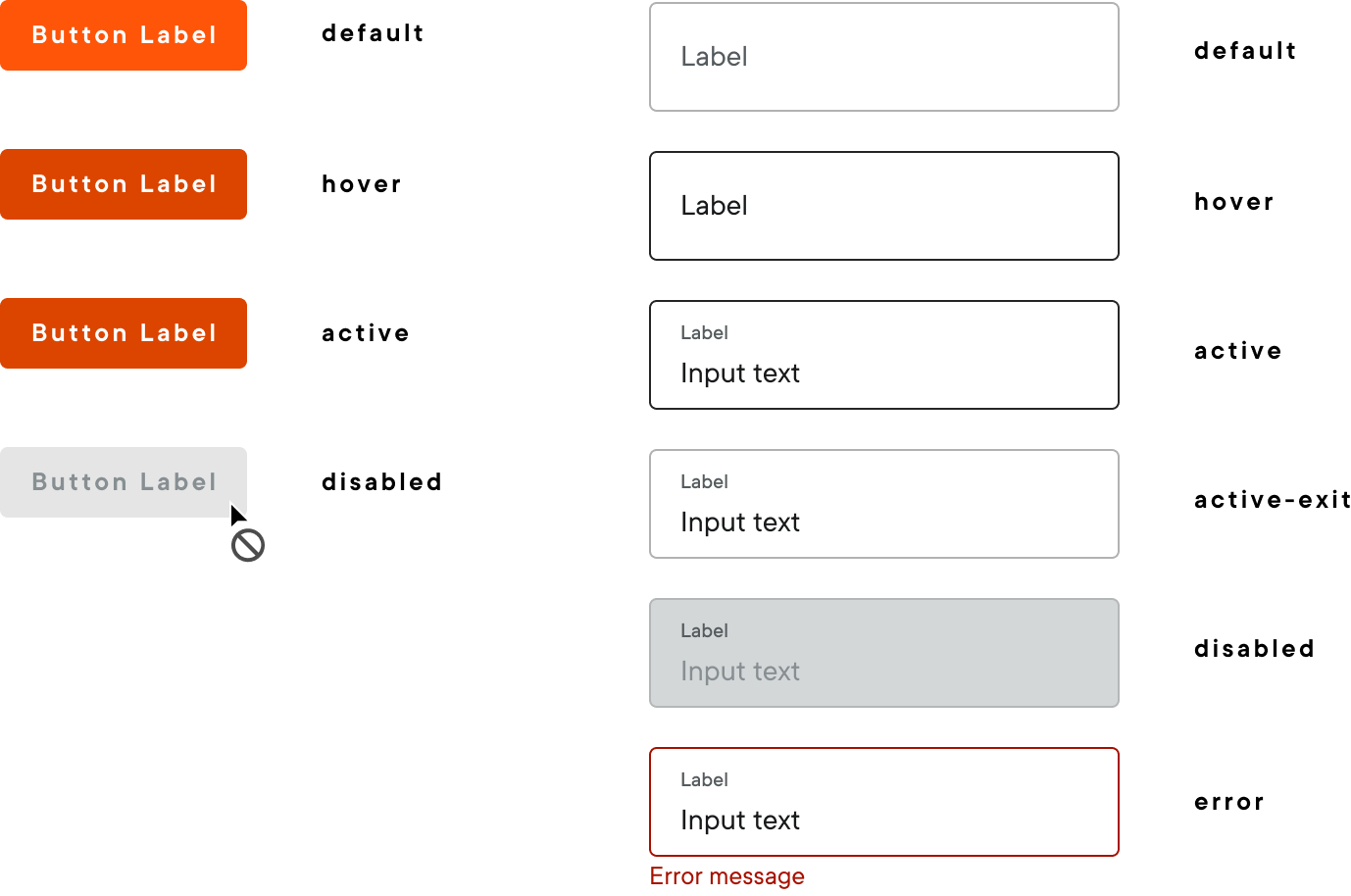
States & Interaction
Clear states make interactions predictable and accessible. Every interactive component has consistent hover, active, disabled.
Clear states make interactions predictable and accessible. Every interactive component has consistent hover, active, disabled.
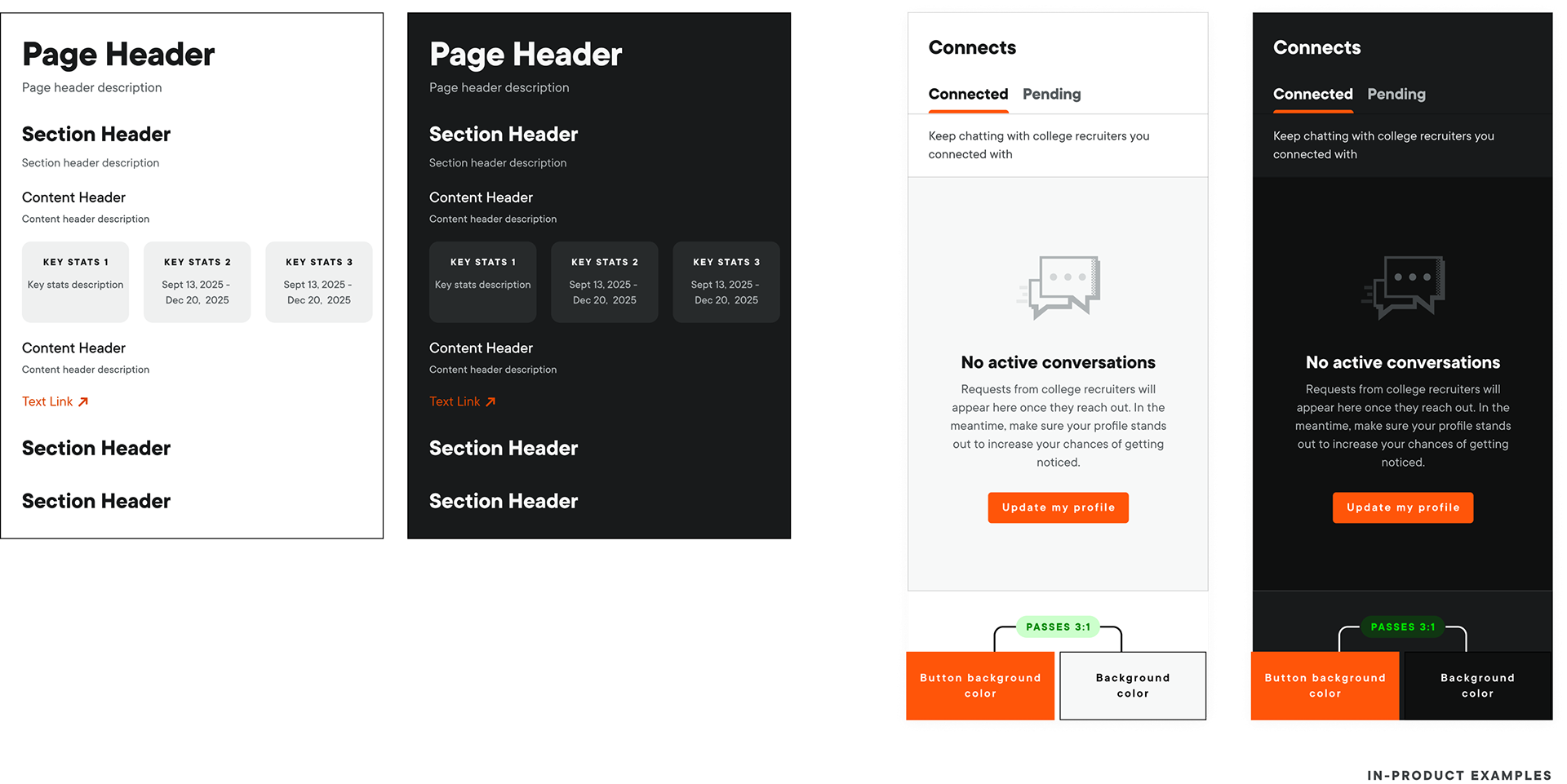
Content type by shape
We use a shape system to improve scannability: media is 16:9 landscape, categories are 3:4 portraits, and people are 1:1 circles, so content type is clear before you even read the labels.
We use a shape system to improve scannability: media is 16:9 landscape, categories are 3:4 portraits, and people are 1:1 circles, so content type is clear before you even read the labels.

Foundations
Brand expression in icons & illustrations
Good interfaces have to do two things at once: stay clear and usable, but also carry a recognizable personality. Our UI foundations were designed to hit that balance, using icons and illustrations as the main carriers of PlayVS’s brand expression.
Our icons act as visual aid to help users complete tasks or understand information. They should be purposeful, informative, and contextual within the interface.
Our icons act as visual aid to help users complete tasks or understand information. They should be purposeful, informative, and contextual within the interface.
- Sharp edges:
We design each icon with inspiration from the sharp elements in our logo to maintain its distinct pointed appearance.
- Soft corner radius:
To balance the sharpness and add a playful feel, we add a 5 pixel corner radius to the edges (with smaller edges having a 3 pixel radius). This also references typographical elements.
- Spacing:
To ensure our icons can be used at various sizes, we keep the line weight at 2 pixels and maintain a 2 pixel distance between elements.

Foundations
Brand expression in icons & illustrations
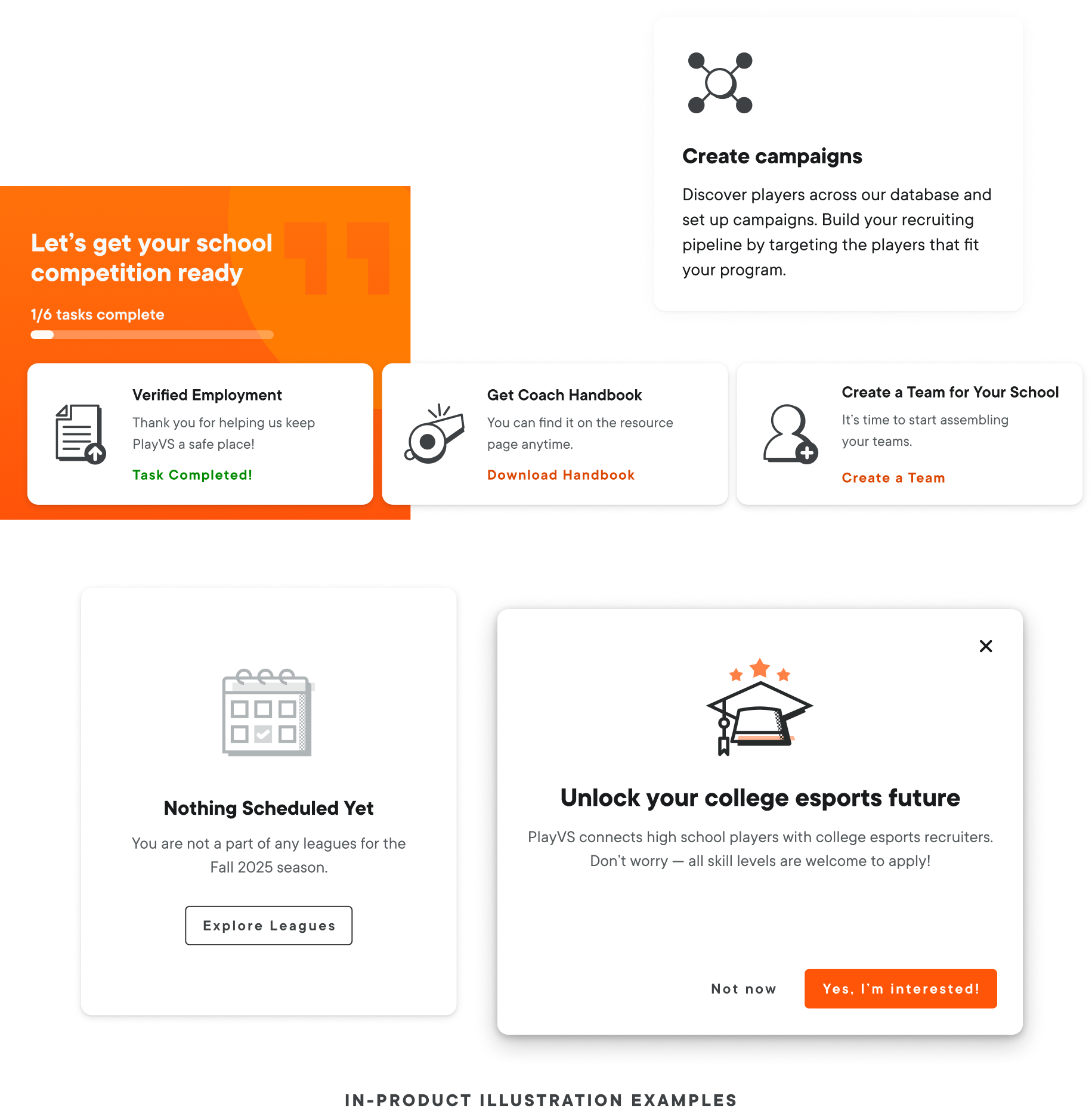
Spot Illustrations are another important aspect of our product design. They offer more creative freedom than icons but must still serve a functional purpose and be appropriate for the context in which they are used. They can be used in various parts of a user interface such as empty states, error pages, dashboards, announcements, onboarding screens, and other places where a visual can improve communication.
Our Spot Illustrations are designed to be:
- Engaging, without overpowering the rest of the UI
- Fun, but not overbearing
- Comprehensive, but not too robotic
Foundations
Brand expression in icons & illustrations
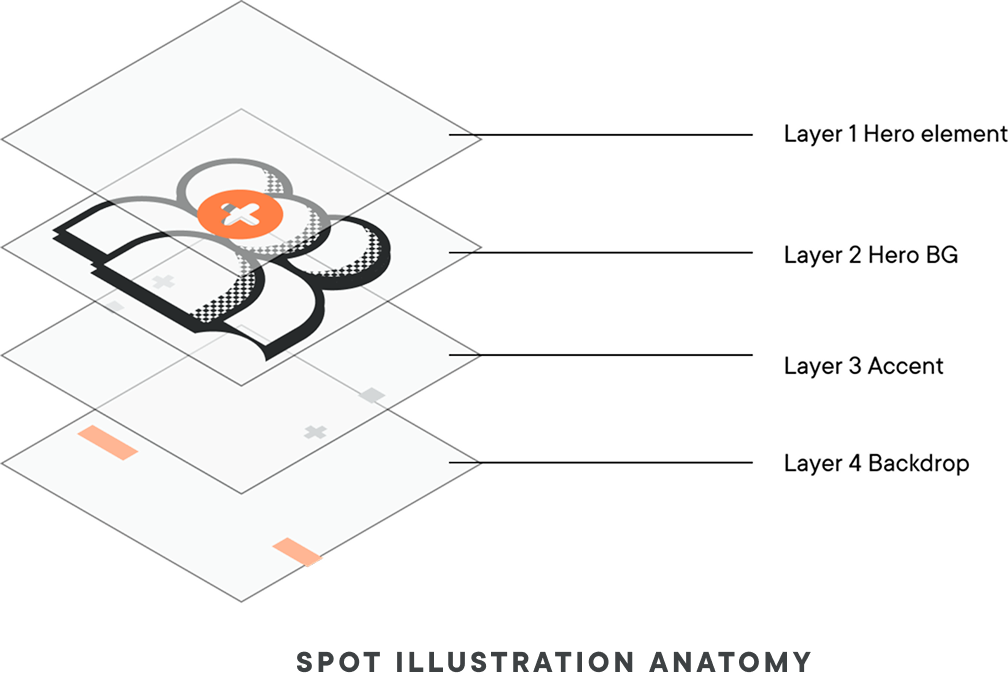
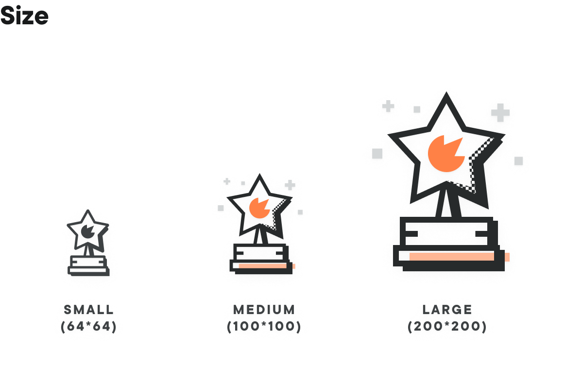
While creating this set of illustrations, we designed them at different sizes (64, 100, and 200 pixels). As the size decreases, the level of detail decreases as well, this way we can have different options for different UI.
For example, an empty state has more space to use the medium size, while task cards have limited space and the small size illustration would be more appropriate.
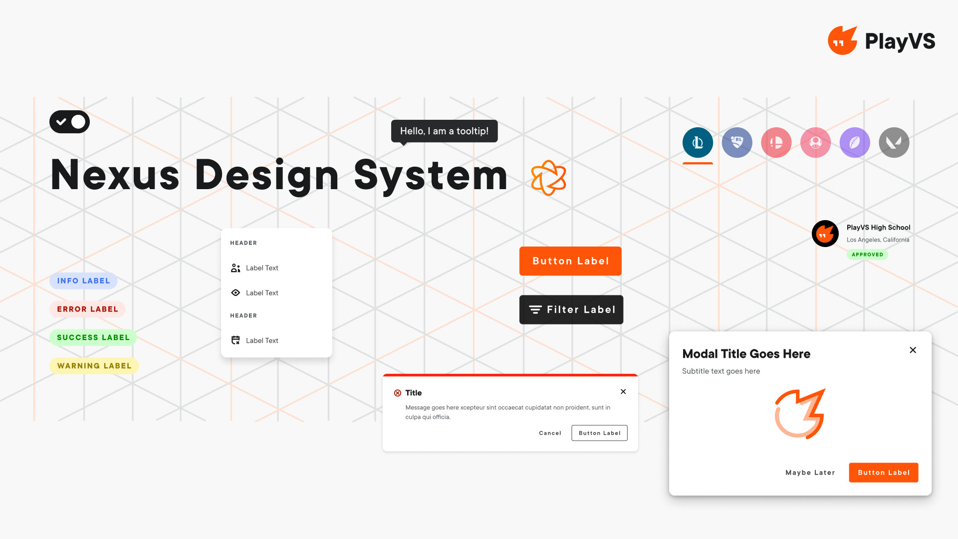
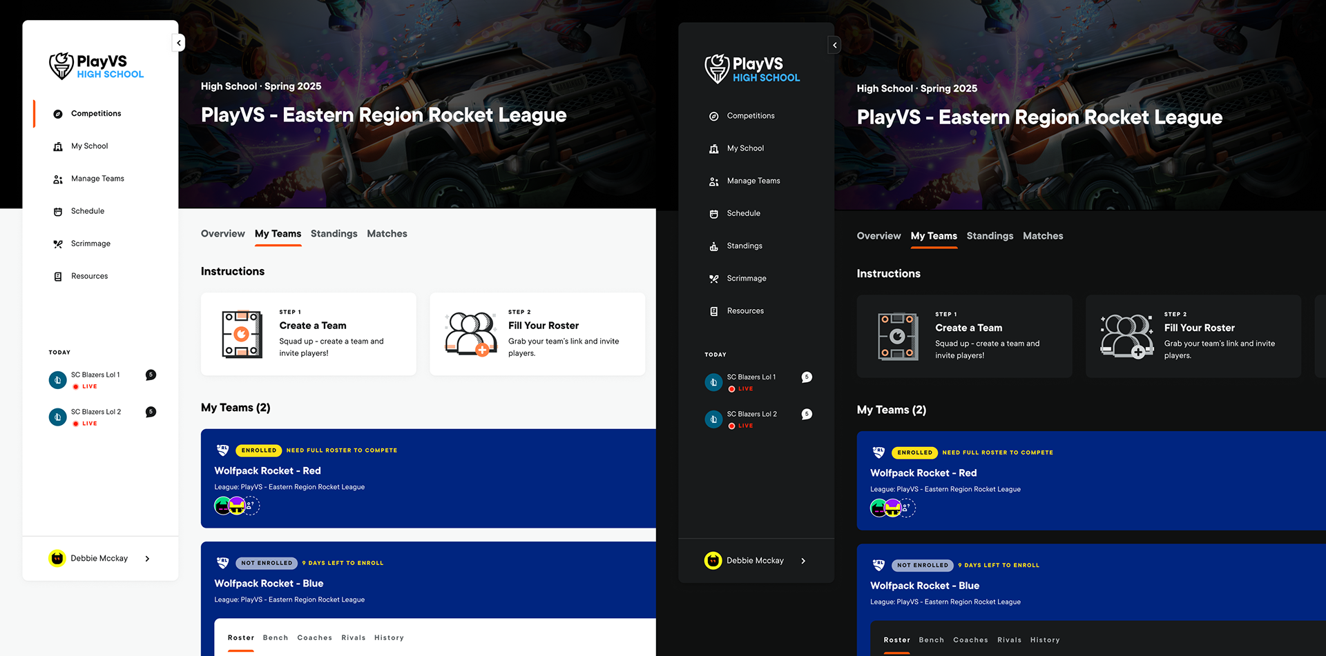
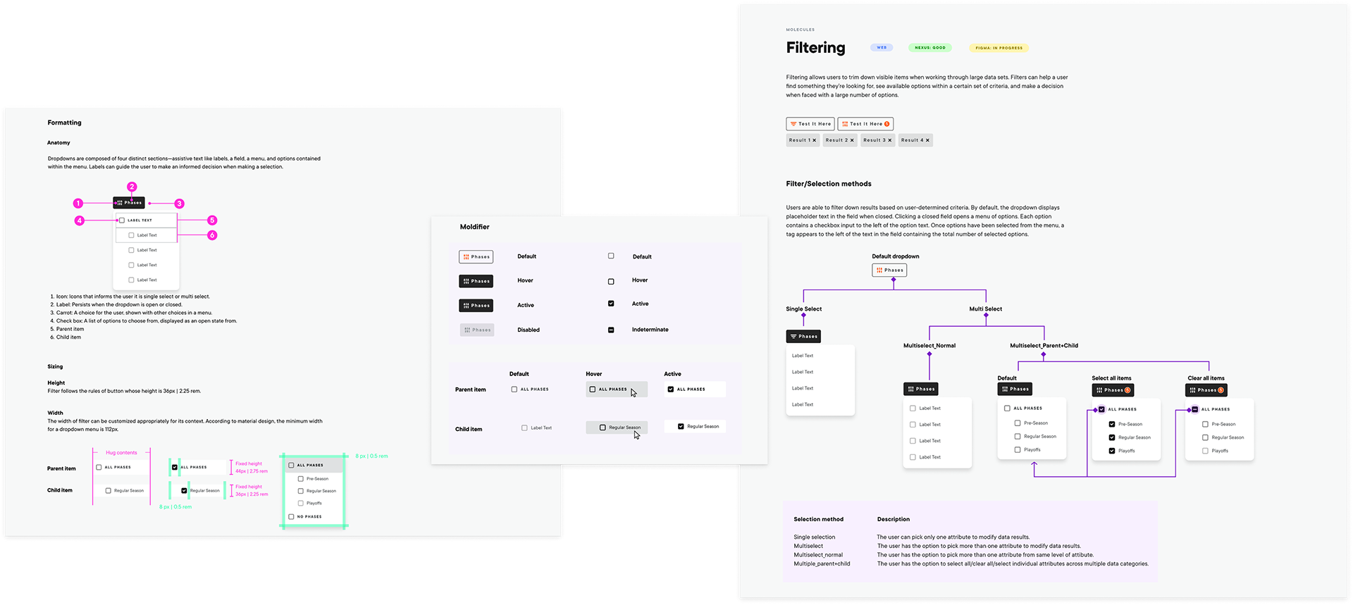
COMPONENTS
Component Overview
Atoms →Molecules →Organisms
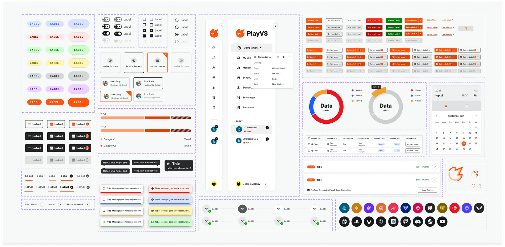
COMPONENTS
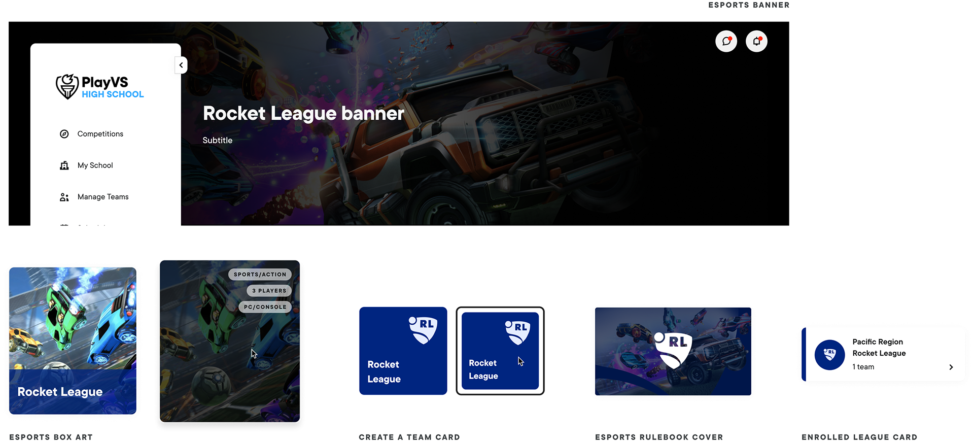
Esports asset library
Collaboration
Component documentation
To streamline our design process and foster team collaboration, we rely on Figma for creating components and documenting our design system. Our documentation is easily accessible to all team members, covering the following key areas:
1. A brief introduction to the components, including a description of their purpose and functionality
2. The component's format and appearance
3. The component's behavior in various scenarios and use cases
4. The different states that the component can be in
5. The readiness of both Figma and Storybook to implement the components
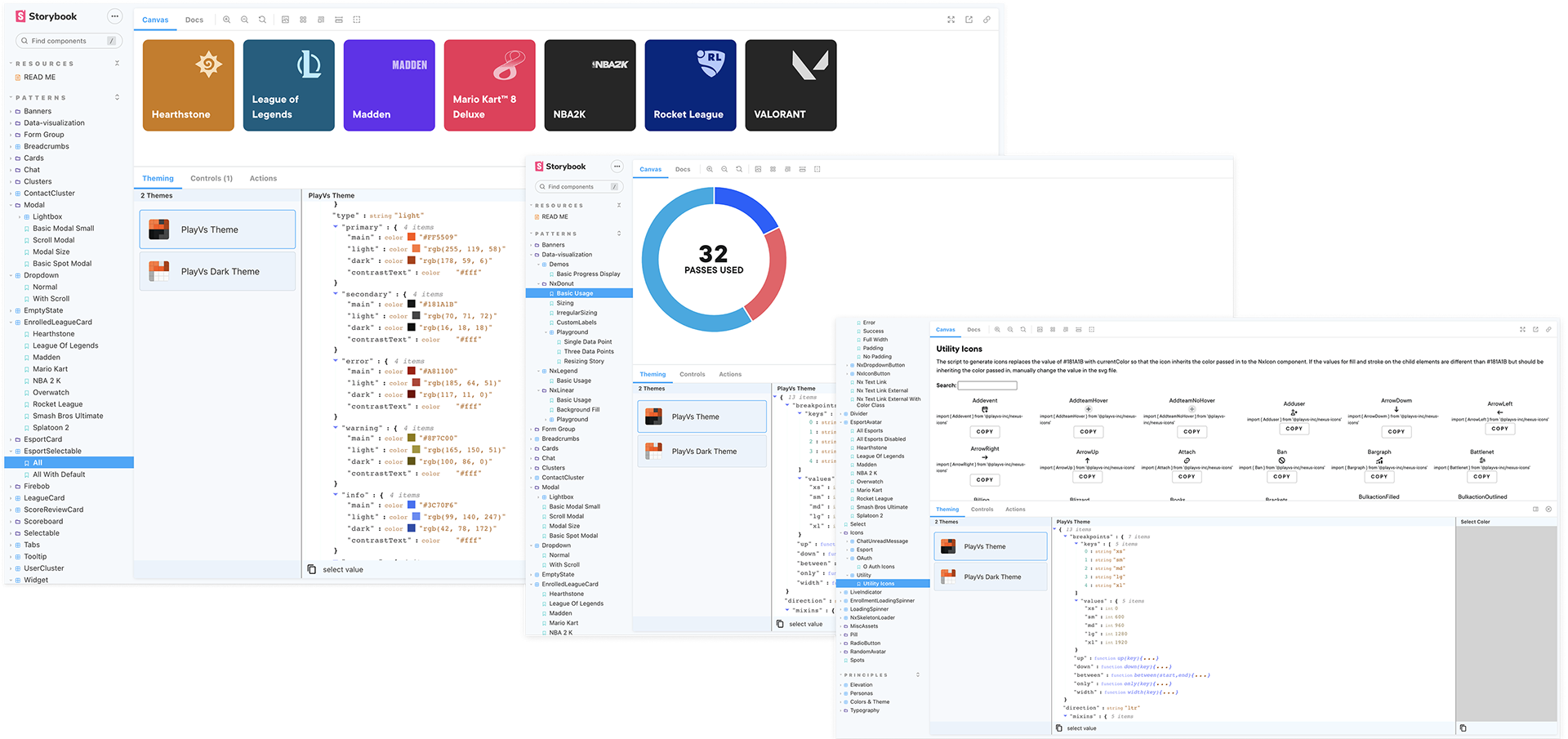
Collaboration
Nexus storybook repository
Our Storybook provides an interactive development environment for building and testing individual components in isolation, which allows for more efficient development and debugging. Our design team and development team work closely to create a centralized pattern library that documents the use cases and variations of each component, making it easy to find, share, and reuse components across different projects.
Collaboration
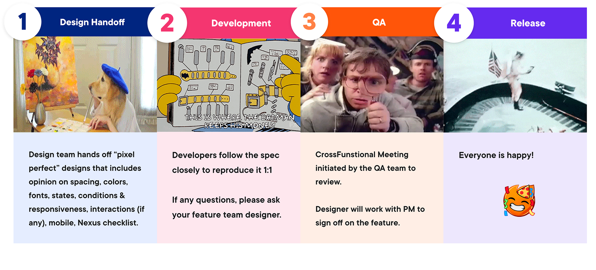
Designing for development
Nonetheless, we have observed that there is often a mismatch between the design specifications and the final production output. What are some ways to improve the collaboration process between teams?
Collaboration
Designing for development
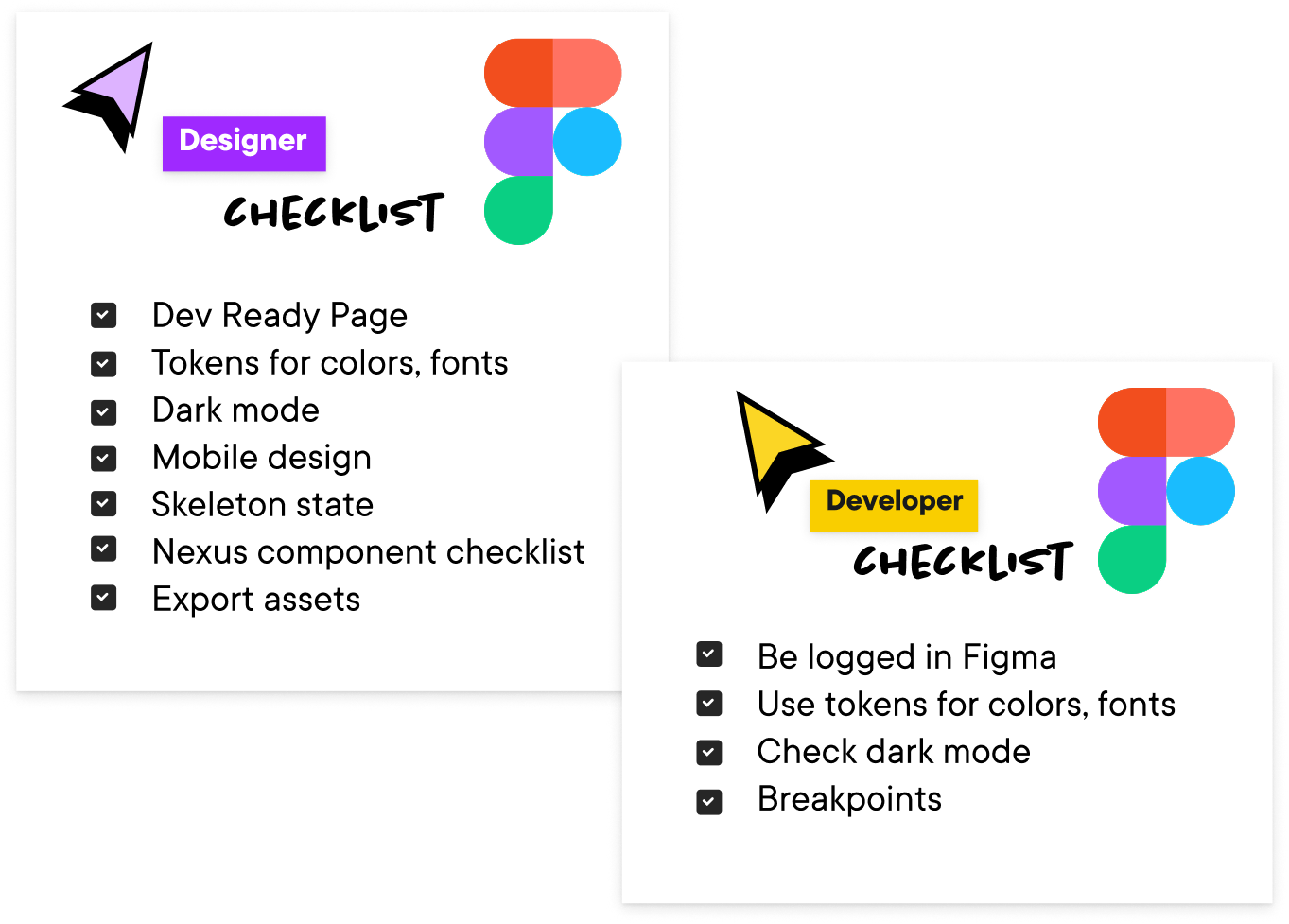
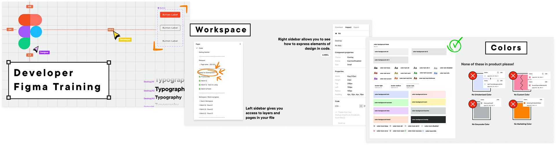
Our design team hosted workshops with the aim of educating all developers within the company on the effective use of Figma. The hands-on sessions were designed to provide practical knowledge and experience in utilizing Figma to its fullest potential. The topics covered included:
- An introduction to Figma's interface and features
- Code inspection: check data for color values, typography, position and sizes.
- Color token: use tokenized colors in design system for development
- Spacing: understand visual guides around the selected element for spacing and sizes and its spatial relations with the surrounding elements.
- Local style: access shared styles for color, text, grids and effects created by designers
- Comment: read, add mentions and write comments on the file
Visibility
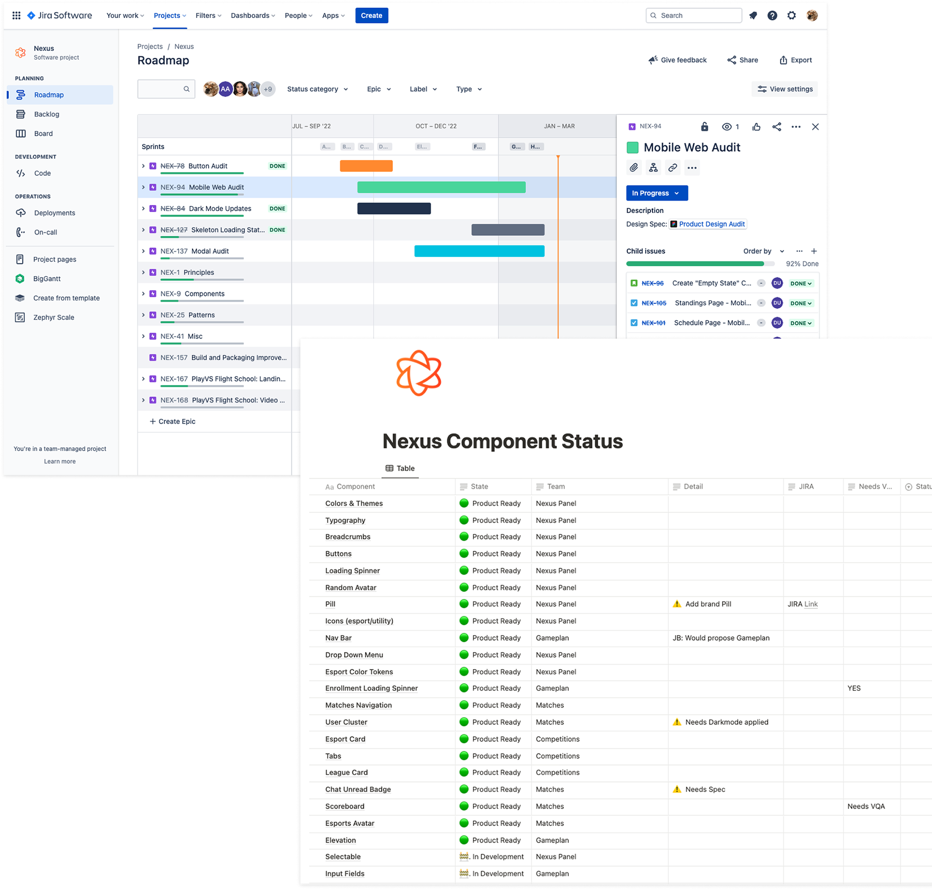
Tracking progress
The Design and Engineering team meet monthly to ensure the forward momentum of Nexus. To streamline the design and development process, we discuss the following topics:
- 1-3 components were prioritized in every upcoming sprint. Designer and engineers reviewed the spec in Figma to ensure easy hand-off to individual engineering teams.
- Reviewed the Nexus Production Storybook, addressing any bugs or issues with teams and updating the Nexus Component List accordingly.
- Worked together to identify and prioritize Jira tickets, determining the best approach for implementation.
- Design also coordinated with EMs to include Nexus tickets in sprints.
- Depending on the scope, engineers had the option of assigning themselves tickets.
Visibility
What’s next?
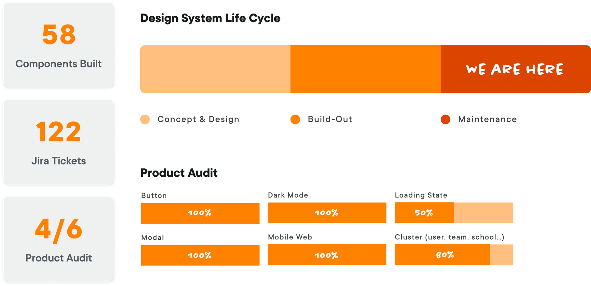
As of November 2025, our latest design system initiative is ~95% through Concept & Design and ~85% through Build-Out. Company-wide reorg in 2024–2025 limited dedicated engineering capacity for further system work, but the foundation we built in 2022–2023—58 Nexus components, 122 Jira tickets resolved, and 3 of 6 product audits completed—still underpins new features and future expansion.
Visibility
Reflections on design system ownership
- A design system needs active advocacy – it only drives value when someone continuously reinforces its use in new features, reviews, and planning.
- As the system owner, I had to act as a gatekeeper for quality and consistency, while still negotiating pragmatically with engineering around timelines, technical constraints, and scope.
- A mature system is one of the most effective ways for junior designers to accelerate their UI craft; clear tokens, patterns, and examples give them an immediate reference for hierarchy, spacing, states, and accessibility.
- Design system work also requires staying current on accessibility standards and industry requirements (WCAG, platform guidelines, state-level rules), so that what we ship is not only cohesive, but also compliant.